Perhaps this information will seem obvious to someone, then you can simply forget about it after reading it or do your own master class, but for someone these tips may be useful.
In this material, there are simple but working methods that will improve the quality of images for a photo forum. As a result, this will help increase the number of views of the work;)
I am not a professional photographer, but I can quite classify myself as "advanced amateur". Watching the photo forum for more than a year, I could not help but notice how poorly the quality of the photograph is sometimes laid out. In this article, I would like to focus on some points that can improve the quality of photographs, and, as a result, increase the number of views.
Have you noticed what quality photos appear in the TOPs of the photo forum? Of course beautiful, high quality.
Of course, not everyone has the opportunity to take professional photography or at least a husband / friend / girlfriend with a good camera and a "photographic vision." Many write that "took a picture of his son" (or daughter). And I understand that sometimes I’m eager to quickly show the results of my work, BUT ... in the end, the number of views directly depends on the quality of the photos, so it makes sense to pay attention to the quality presentation of their works. This is the main idea that I would like to convey. All the tips below are the details that make up the result.
So, let's begin.
1. Focus. Paradoxical as it may sound, the FF presents a huge amount of work without focusing on the main subject. And it doesn’t depend on the quality of the camera - I have met repeatedly out of focus photos taken with expensive SLR cameras.
Many modern cameras have built-in face detection - it makes sense to use this. Sometimes there is even a function of focusing on that part into which the user "poked a finger" on the screen. If there are no such functions, the main focusing rule for all digital cameras is focus. in the center frame. That is, you need to place the object in the center.
At the same time, even for compact cameras (not to mention the more expensive SLRs), there are two types of pressing the shutter button. First press halfway. At this moment, the camera focuses and the camera screen displays which zones the camera was able to focus on. The second press is to the end when the camera takes a picture.
Always use the half-press first to make sure that the camera is focused. If focusing does not happen, then you need to change something, for example, move the camera away.
To take a picture in focus, it is easiest to point the camera so that the subject is exactly in the center of the frame, press the shutter button halfway. Then, when the camera focuses, without releasing the button (otherwise focus will be lost), you can move the camera to the desired position (for example, so that the subject is slightly to the right of the center of the frame or slightly to the left) and then press the button to the end. It can be written quite confused, but in reality it is much easier :)
2. Lighting. Even for professional photographic equipment, shooting in poor lighting conditions is not an easy task. For phones and simple compact cameras, adequate lighting is simply a must to take a quality shot. With insufficient lighting, noise appears, the image often turns out blurry.
Ideally, the lighting should be daylight, natural. Not artificial. Fluorescent lighting, fluorescent lights and all other light bulbs have their own color temperature. Even if you set the appropriate white balance setting, there is a good chance that the frame will still turn out with some kind of shade - yellowish, greenish, reddish (depending on the type of lamp).
Of course, you can use the flash, but it makes the image flatter + in the vast majority of cases, the problem of "red eyes" appears. Again, note that in the TOP, almost all photos are taken in the daytime / in good light.
And one more thing about the light. It’s best not to take pictures in direct sunlight, but in the shadow. And preferably not in a deep shadow, but somewhere closer to its border with direct sunlight. This allows the light to be softer, but at the same time, the overall level of illumination remains quite high.
If photography takes place indoors, it is best that direct sunlight does not fall out of the window. It is also advisable to move a couple of meters from the window (so that the light is more diffuse, soft). Avoid standing with your back to the window: the photograph is likely to turn out dark. It is much better if you stand facing or sideways to a light source.
3. Background. The main rule - the simpler the background, the more attention to the main subject. Particularly distracting are small objects in the frame, and such things as, for example, an open cabinet door or a piece of a bench sticking out in the corner of the frame.
I met repeatedly that users show the beauty of some places. There is nothing wrong with using beautiful places as a backdrop. At the same time, do not forget that this is still not a forum of travelers, and not a personal page in the social. networks, and a forum where they look at manufactured things. The focus is on the main goal - the model.
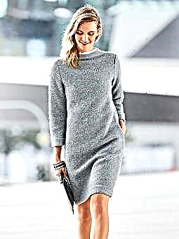
4. Posing. How often on this site in the comments on the models from the magazine you can see something "a model in such a pose that it is not at all clear what kind of thing is on it." Therefore, at least one photograph (preferably a title one) should be with a simple pose, ideally standing. No one says that it is necessary, but you can evaluate the fit of the product when you are standing level.
5. Photo processing. This paragraph is not obligatory at all, but as they say, "why not YES?" Of course, it all depends on the degree of computer skills, but many programs are intuitive and you can do simple things in them (trim too much, increase brightness / contrast).
The main thing when processing photos is to find a certain middle ground and not go too far with the effects :)
6. The title photo. This is the photo that is the first among all the photos to be added and which is reflected in the tape of all exhibited works at the photo forum. It is on it that they ultimately evaluate whether it is worth clicking on the link and looking at the product in more detail or not. In addition, this image in the FF tape is quite small. Be sure to think about which photo to put first in the list when adding your work to the FF.
If the title picture has a lot of background and a little little man, then you can hardly see something there. Interest in such work will not be high. Perhaps it makes sense to trim too much for the title photo, as well as think about it at the photography stage;)
And further. You can rotate the image (if necessary) 90 degrees and then save it in this form even through the standard computer image viewer, not to mention Paint'e. Unfortunately, there are repeatedly works in which the image is not correctly rotated.
That's basically it. Of course, for owners of serious photo equipment, you can tell a bunch more other information, but the tips described above are primarily not for them, but for those who take pictures on phones or digital "soap dishes". Those who are interested in the topic of photography can read thematic photo resources (I did not set myself the task of disclosing the extensive subject of photography here).
And finally. I hope that it is obvious to you (as to me): an ideal photo does not guarantee getting into the TOP (after all, it is estimated that in the final analysis, a thing that is still made). But with low-quality photography getting into the TOP is much more difficult.
I hope that these recommendations turned out to be useful for you, or at least allowed you to think about what quality of the photos you are uploading to FF.
Thank you for your attention and wish you all success.


